How might we design an experience that allows candidates to validate their job skills & enable recruiters to quickly identify top talent?
My Role
- Product Design Lead
Team Members
- Angel Poon (Product Manager Lead)
- James Lin (Engineering Lead)
- Tim Yang (Engineer)
- Marko Kajzer (Engineer)
A little on AngelList
AngelList is a two-sided platform that connects startups with top talent globally. One one side, it allows job seekers to showcase their skills and experience, and apply for relevant jobs at various startups.
On the other side, it allows startups and companies to post jobs, browse through the profiles of potential candidates, and reach out to those they are interested in. It also offers features like applicant tracking and recruitment CRM to help recruiters manage their hiring process more efficiently


Discovery & User Research
Identifying key user pain points
Uncovering Insights
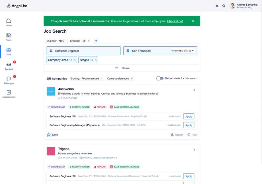
When I started working on AngelList Assessments, it existed in a rudimentary state. The number of assessment takers was minimal, and the majority of recruiters were unclear about the value these assessments provided. I worked with my PM to discover key user pain points.
We began by conducting user interviews with both job seekers and recruiters. For job seekers, we found that they often struggled to differentiate themselves merely with resumes and cover letters. For recruiters, the challenge was sifting through hundreds of similar-looking profiles to identify genuinely skilled candidates.
Confusion on purpose
From Job Seekers + Recruiters – (Insight) Both job seekers and recruiters expressed confusion regarding the purpose and function of the assessments. (Implication) This showed a clear gap in communication and understanding, highlighting the need for better explanation and guidance within the platform.
Security Concerns
From Job Seekers – (Insight) Some users were hesitant to share personal information or take assessments due to privacy concerns. (Implication) Clear communication about data usage and robust security measures may alleviate these concerns
Incentivization
From Job Seekers – (Insight) Some users noted that the current form of Assessments lacked any form of recognition or incentive for completing assessments. (Implication) Creating a reward or recognition system might motivate more users to engage with the assessments.
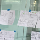
Following multiple rounds of user research,  I led the team in workshops that helped us better define the
  value props that AngelList Assessments
  offered to both recruiters and job seekers
  .
.
Design Highlight: Emphasizing & Value Props.
Insights from our research revealed that a necessity for a thorough and personal sign-up process
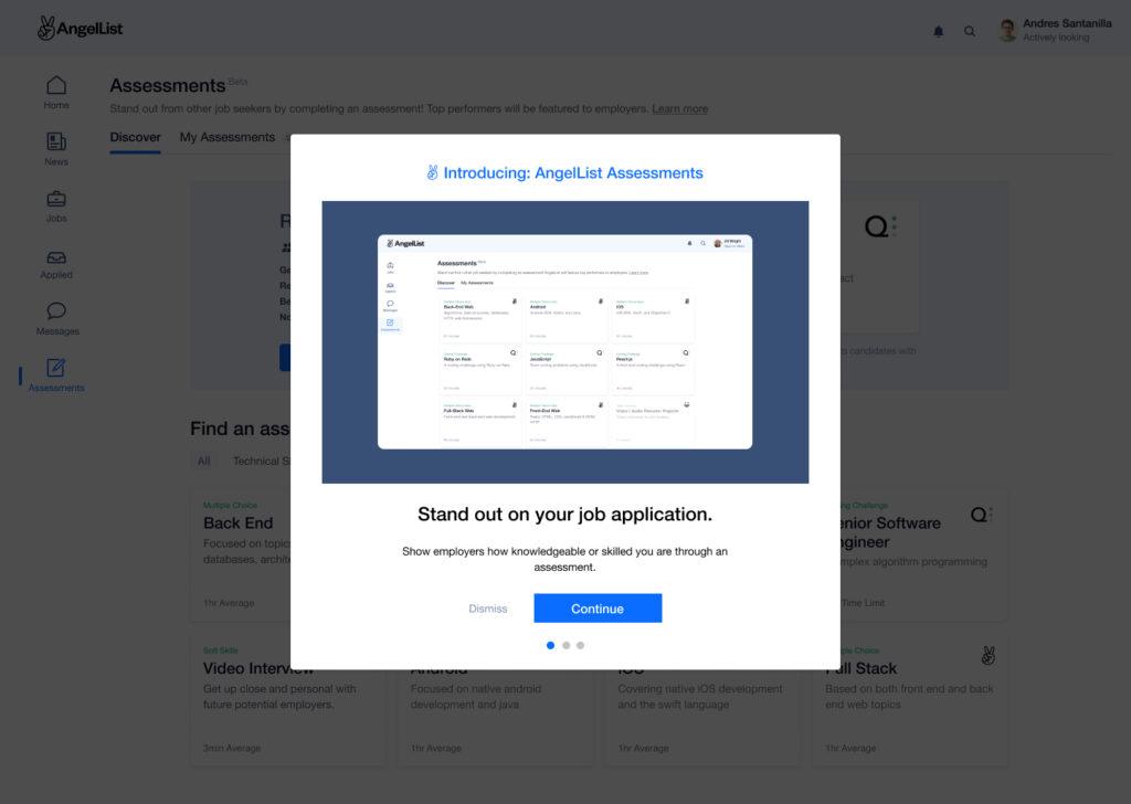
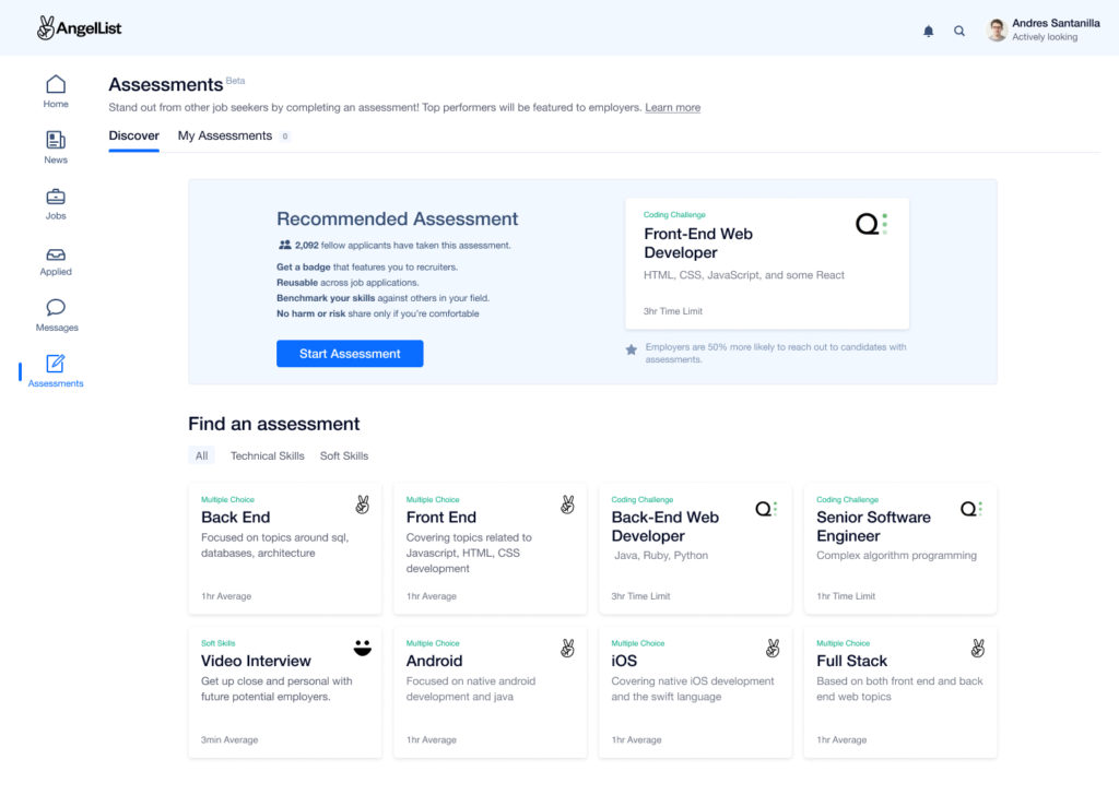
Job Seeker: Learning about Assessments
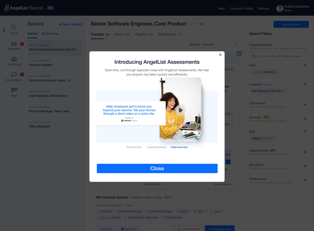
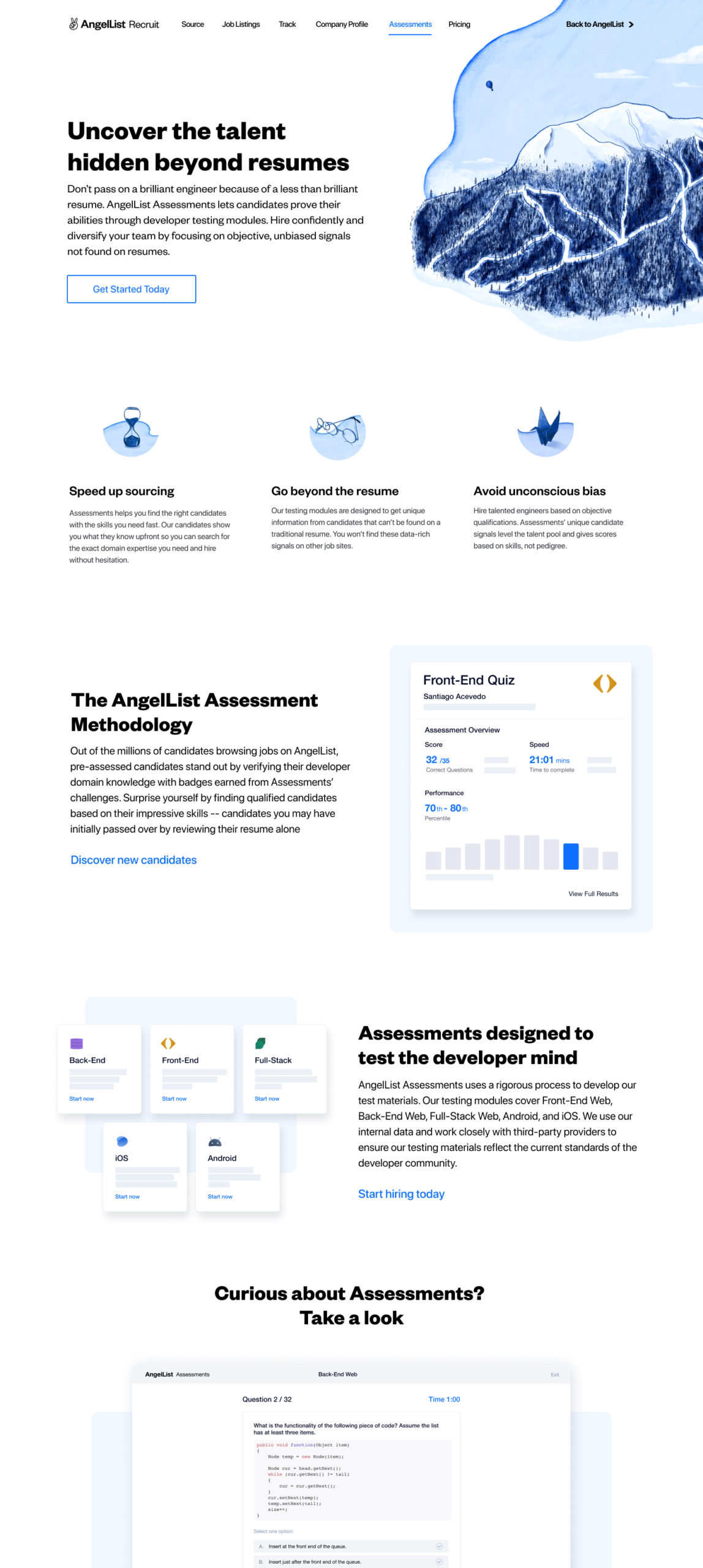
The redesign actively engaged users & explained why and how Assessments benefited them. This emphasis not only built trust but also integrated the assessments seamlessly into the recruitment and job application experience, driving user satisfaction and success.
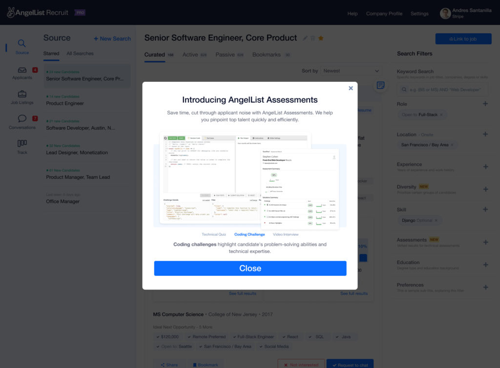
Recruiter: Learning about Assessments
Design Highlight: Results redesign.
Where we focused on how to create an easy path to finding the perfect healer and scheduling a session
Results Page Interaction
0:45 duration
Conclusion
The focused approach on discovery and user research allowed us to turn a rudimentary product into a valuable tool for both job seekers and recruiters. AngelList Assessments is a project that I look back on with pride and a sense of accomplishment, and it serves as a powerful testament to what can be achieved through thoughtful design and collaboration.


