Parenting is hard,

we made it easier.

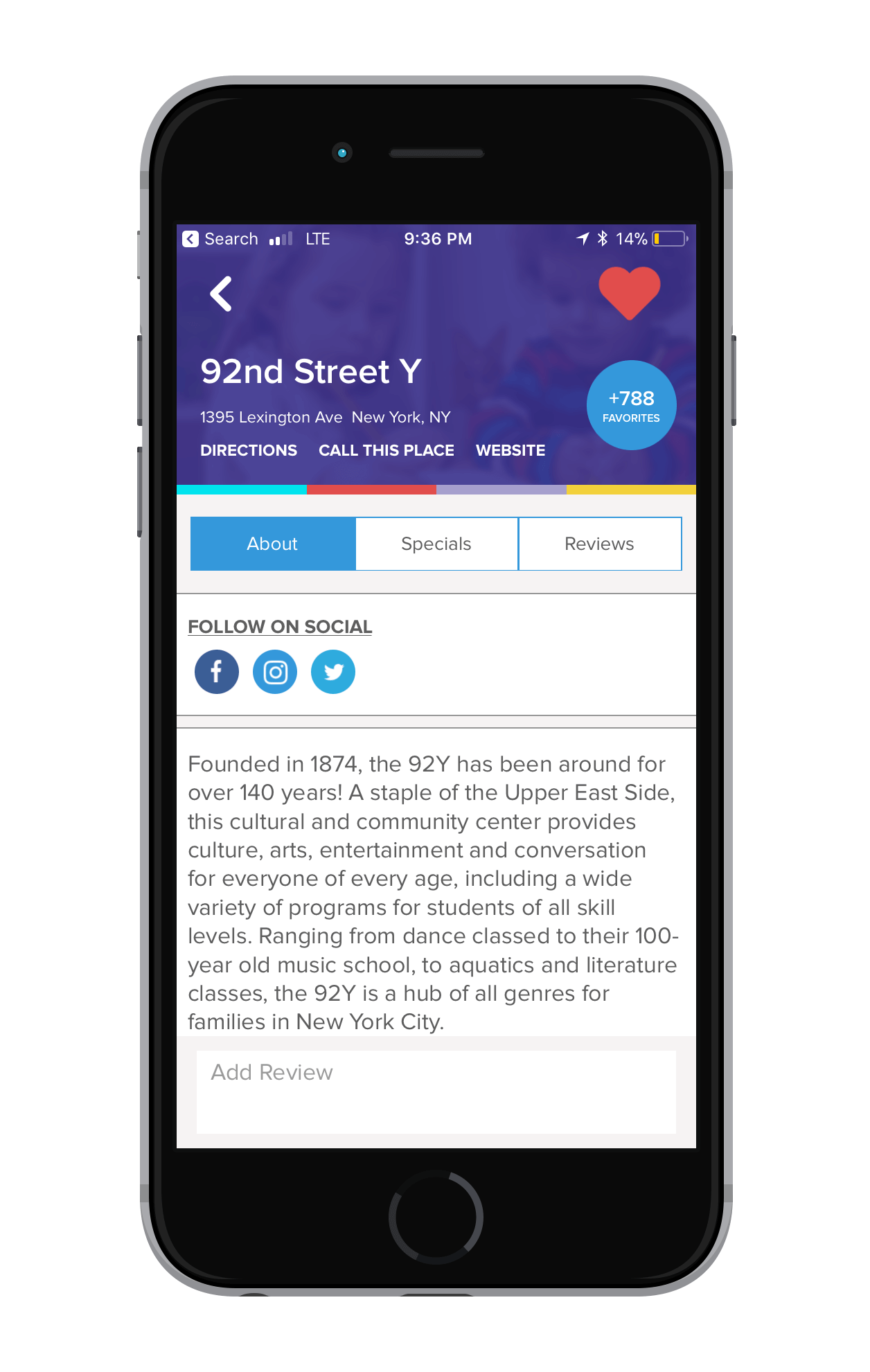
The Mommy Nearest app has become the most-trusted app for parents looking to discover family-friendly places across the country. Eliminate the struggle of on-the-go parenting! Our locator tool finds parent-approved places like museums, parks, restaurants and play spaces wherever you are.

Problem

Finding kid-friendly activities can be hard. Parents, especially first time parents, spend an exorbitant amount of time, money and energy consuming both content and products that could make their lives easier. How can we create an experience for parents that helps save time and money, while providing an unique and unforgettable experience?

Solution

The Mommy Nearest app gives parents insider activities, discounts, unique content, and more — providing an overall encompassing resource that helps deal with the trials that come with being a parent.

Target Audience
  • Parents of children aged 0 to 9 years old. 
  • First time parents
Roles
  • Lead UI Designer: created app’s complete design
  • Prototype Creator: built style guide along with components in app
  • UI Developer: built app along with 6 other developers
Built With
  • Sketch (Design)
  • Photoshop (Design)
  • Invision (Design)
  • React Native (Development)
  • GraphQL (Development)
See Live (Spoiler Alert)
THE PRELUDE

User Research

Understanding User Needs

In the beginning stages of redesigning the Mommy Nearest app, we brought in power users for feedback on their current experience of the app + things they wished were better.
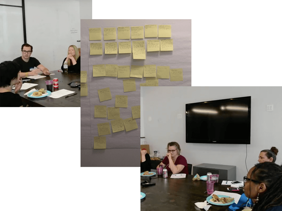
Journey Mapping + collecting information from users about their reactions to our product, service, and website experience.

Main Takeaway One

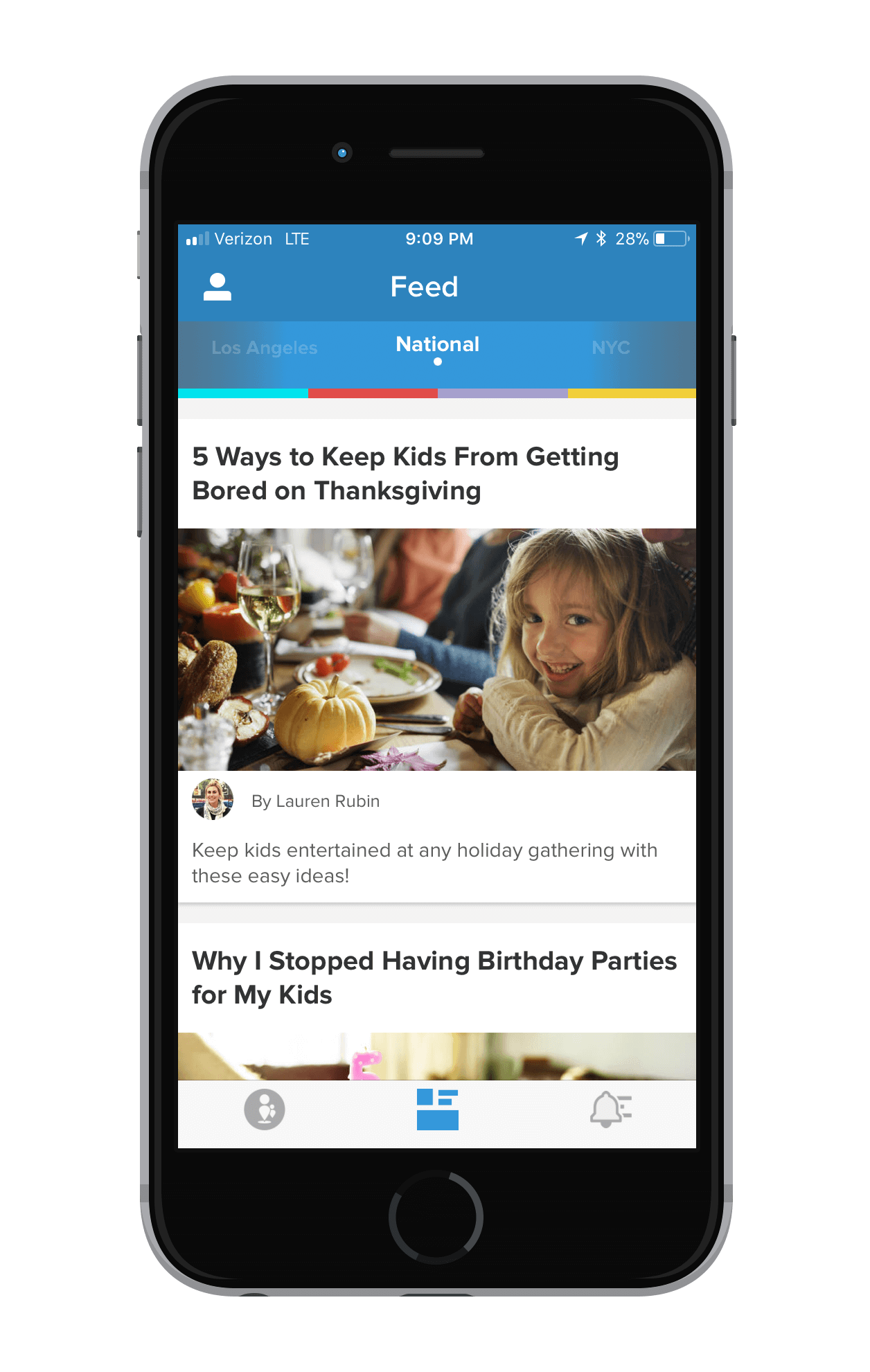
Users found that the old app’s was more content driven. They rarely used the locator component but read a lot of articles.
Design Decision
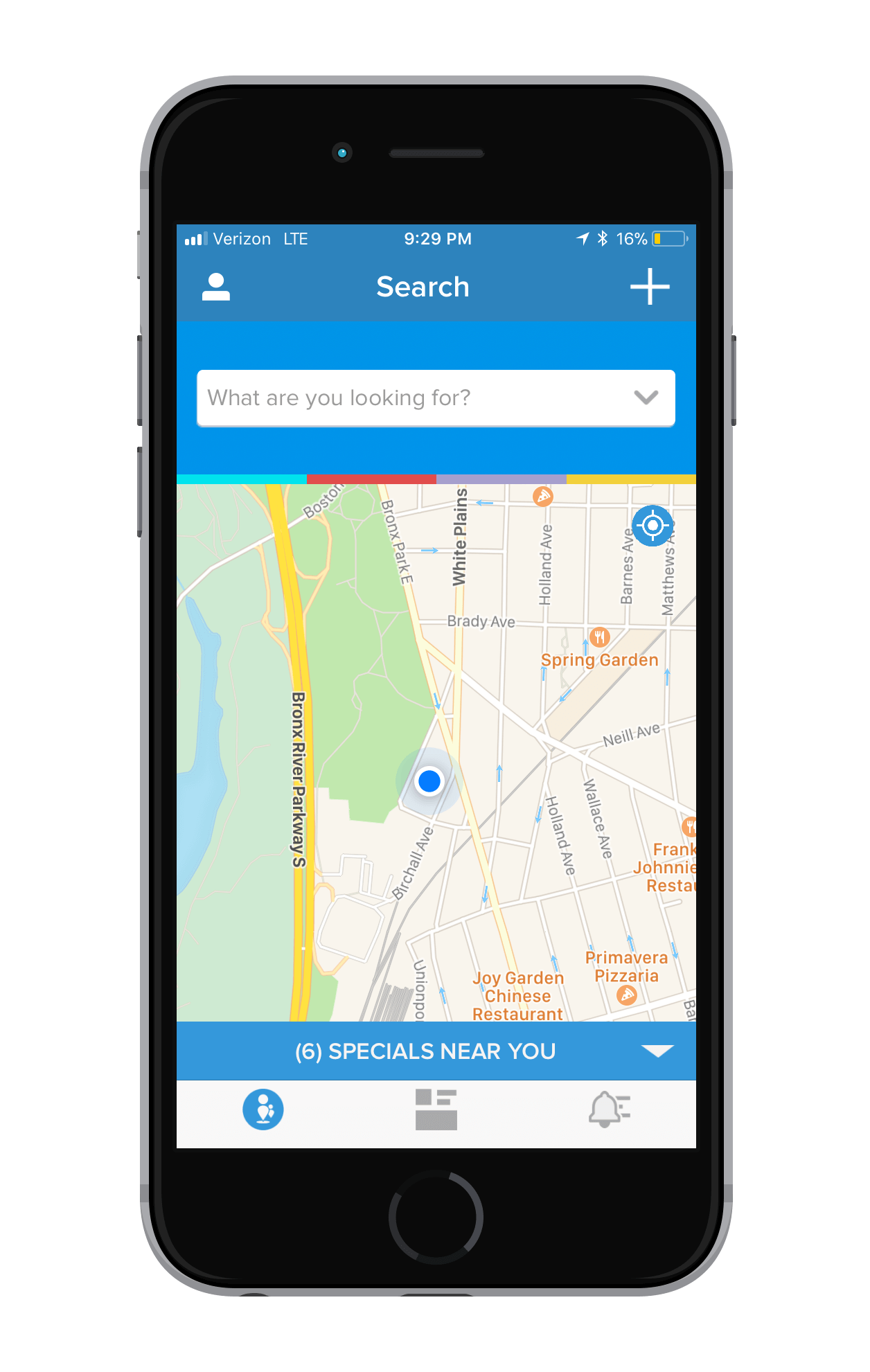
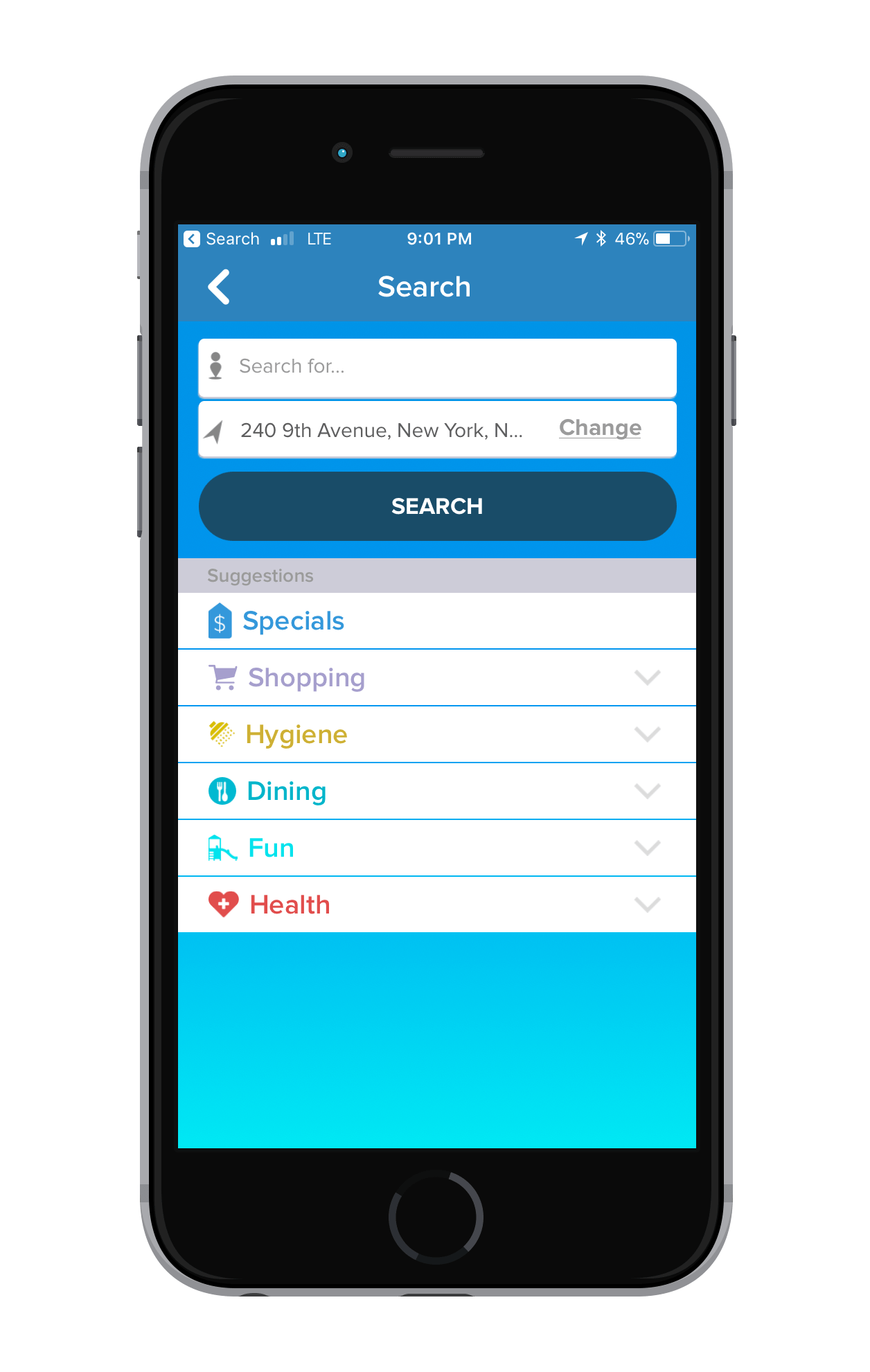
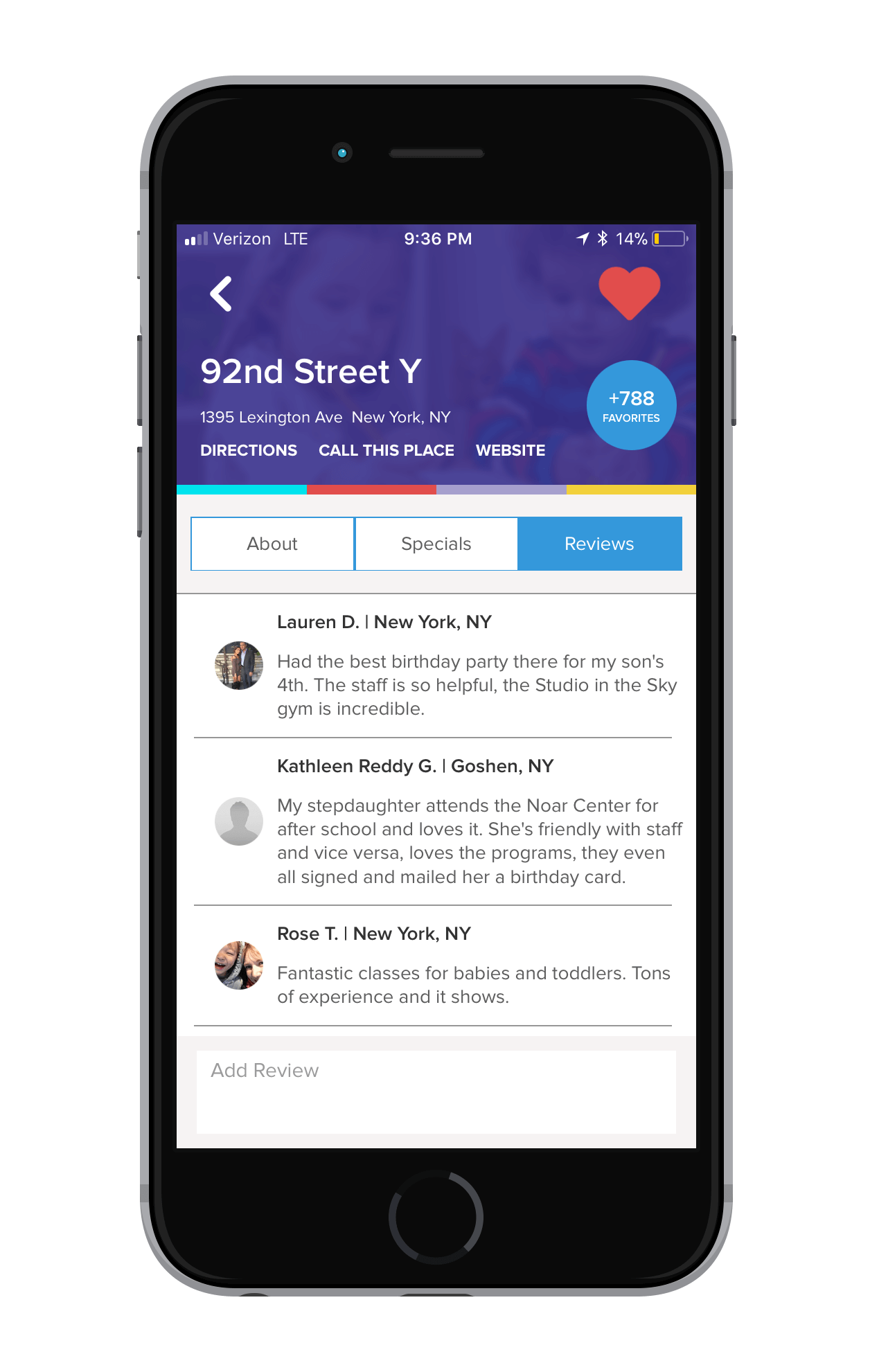
Our main feature (essentially our bread and butter) is our locator feature. With it, we geo-locate our user and show them the 50 closest child-friendly places based on their search parameters. Places on the app are rated and reviewed by other parents, thus layering in a level of trust. Higher rated places and partners are higlighted. I decided to make the new app’s landing screen the Locator screen.

Main Takeaway Two

When users did utilize the Locator component, they found the map navigation’s to be ineffective and hard to use.
Design Decision
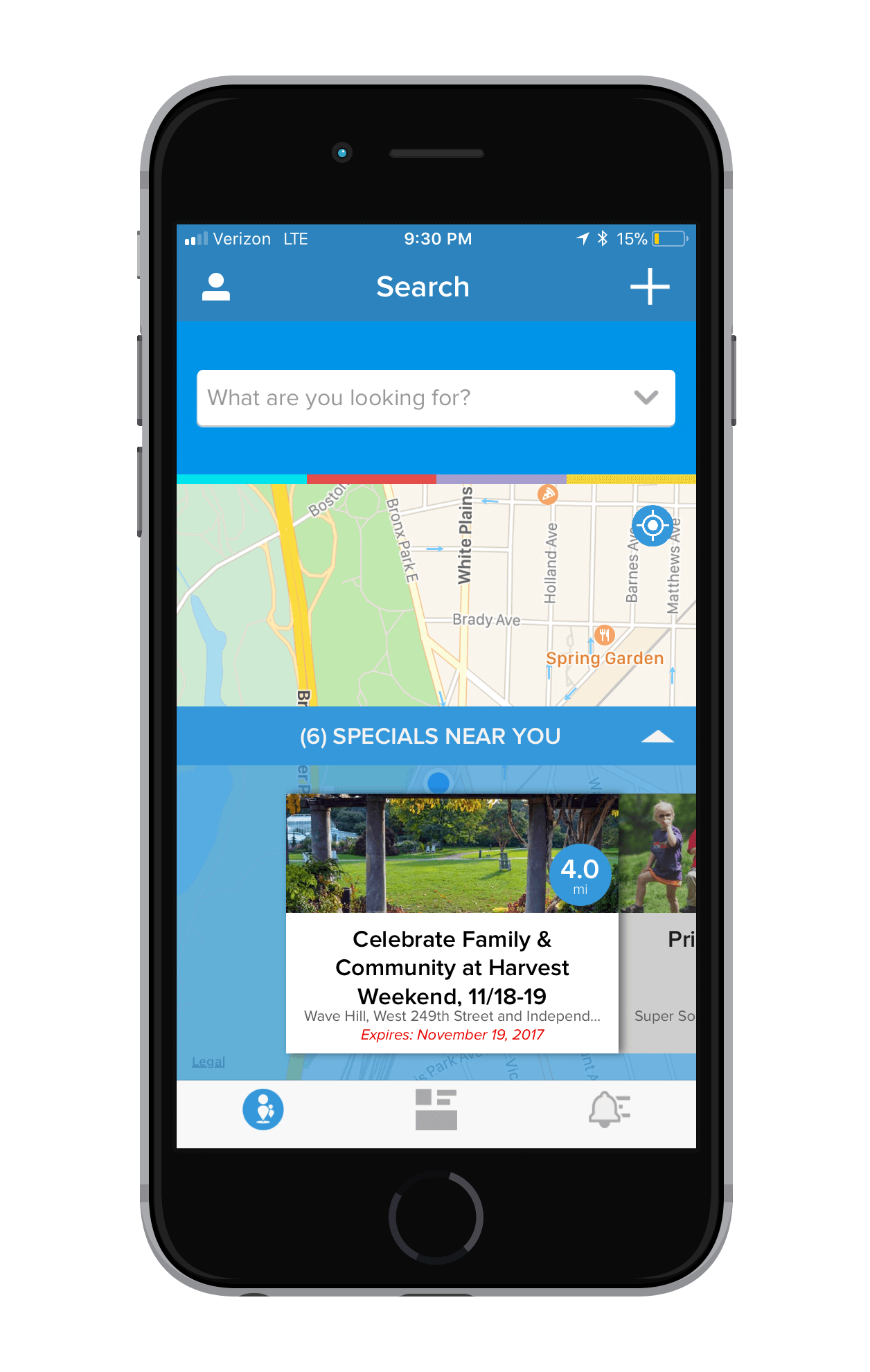
Since the Locator screen would now be the home screen, it was imperative that it delivered the best possible user experience. I decided to make the Locator screen take up 85% of the screen’s height. I also created a new component “Specials near you”. Every time a user opens the app, this component shows the nearest discounts and specials at partner businesses near them.

Main Takeaway Three

Users didn’t feel like the old app experience drove engagement.
Design Decision
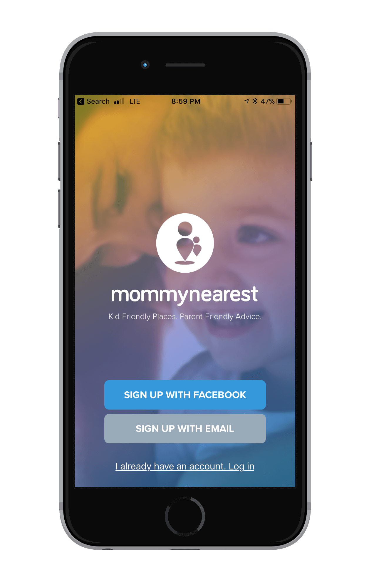
Data-wise- we didn’t know much about our users other than their location and how many children they had. I decided to expand the app sign up experience to include sections that built upon our user profile data. Now, we have self-tagged data that tells us what type of places users families enjoy as well as self-tagged descriptors. This allows us to create a more personalized experience.
Pushing to Production

The Mommy Nearest App

What We Delivered

I was lucky to work alongside a amazingly talented team to create the new and improved Mommy Nearest app. All in all, I’m proud of what we created.


MENTIONS
    • “Must-have apps for new Moms” View Here

  • “6 New-Mom Apps for Tackling the First 6 Months”  View Here
Months to Build

4.5 months

COMPANY
Mommy Nearest
YEAR

2017

In the Wild

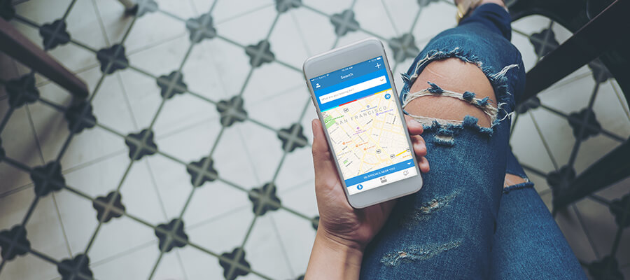
See the app in the wild

*Photos below created by fellow designer, September Broadhead