In 2015, I was brought in to recreate the brand image of Mommy Nearest. Already a staple in the daily flow of thousands of parents, this was no small task. The challenge was to keep the whimsical nature of the old branding, while recreating the company’s image into something more modern.
Discover family-friendly places near you.
Problem
Mommy Nearest wanted to change it’s old brand look into something more sophisticated and business-like.
Client
Roles
- Created brands style guide
- Supervised design direction of Design team
- UI Developer: built web products along with 5 other developers
Built With
- Sketch (Design)
- Photoshop (Design)
- Invision (Design)
- Illustrator (Design)
- Ruby on Rails (Development)
- EmberJS (Development)
- SemanticUI (Development)
- Mixpanel (Analytics)
- Google Analytics
See Live (Spoiler Alert)
THE PRELUDE
Old Branding
THE PRELUDE
Market, Brand / User Research
Market Research
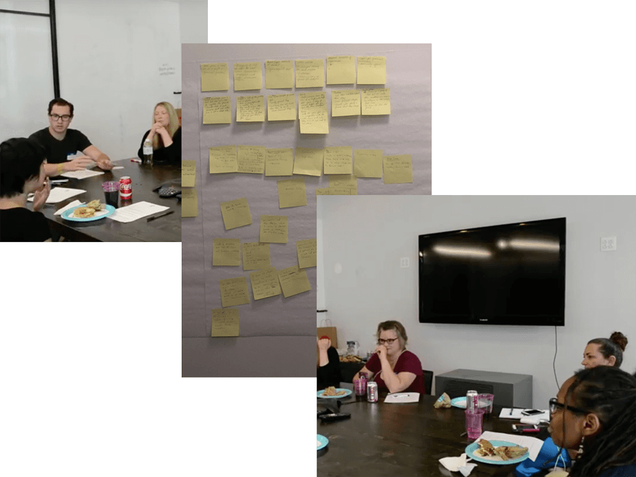
After sitting with the project for awhile, I brought in what we termed “Power Users” to get their opinions on the Mommy Nearest brand as well as designs we were working on. These included rough sketches of potential logos, rough sketches of the website, as well as other marketing material. The research conducted led to three core takeaways A) the new brand must be cohesive and each external product should showcase one another B) The old logo’s main character had no story and thus no emotional connection to the user. (Since we don’t want to define what a mother “looks” like, the logo should not be illustrative and instead showcase the idea of our old logo (mother and child) in a non-literal manner) C) Women don’t automatically like the color pink. In fact, all participants hated our old color scheme. The new color scheme should invoke feelings of happiness and whimsy while straying away from stereotypes.
PHASE ONE
Logo Creation
The Process
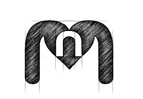
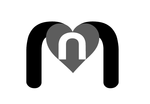
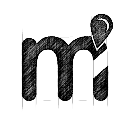
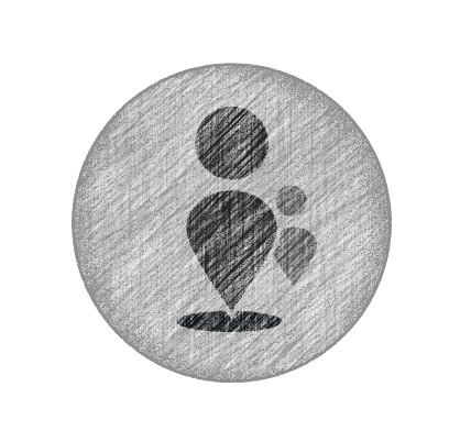
After sitting with our “Power Users” and creating the core takeaways, I got to sketching. The MommyNearest logo will always be near and dear to my heart, specifically because the logos I spent the most time on were killed and the one I spent the least time on (literally a quick afterthought) is the one everyone fell in love with. “Kill your darlings” — true story. Here is the sketch process of three of the finalists.
Three Final Versions


PHASE TWO
Marketing Items
Logo & Marketing
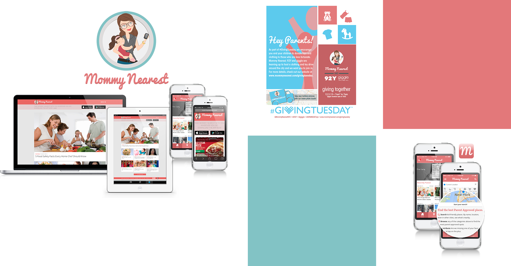
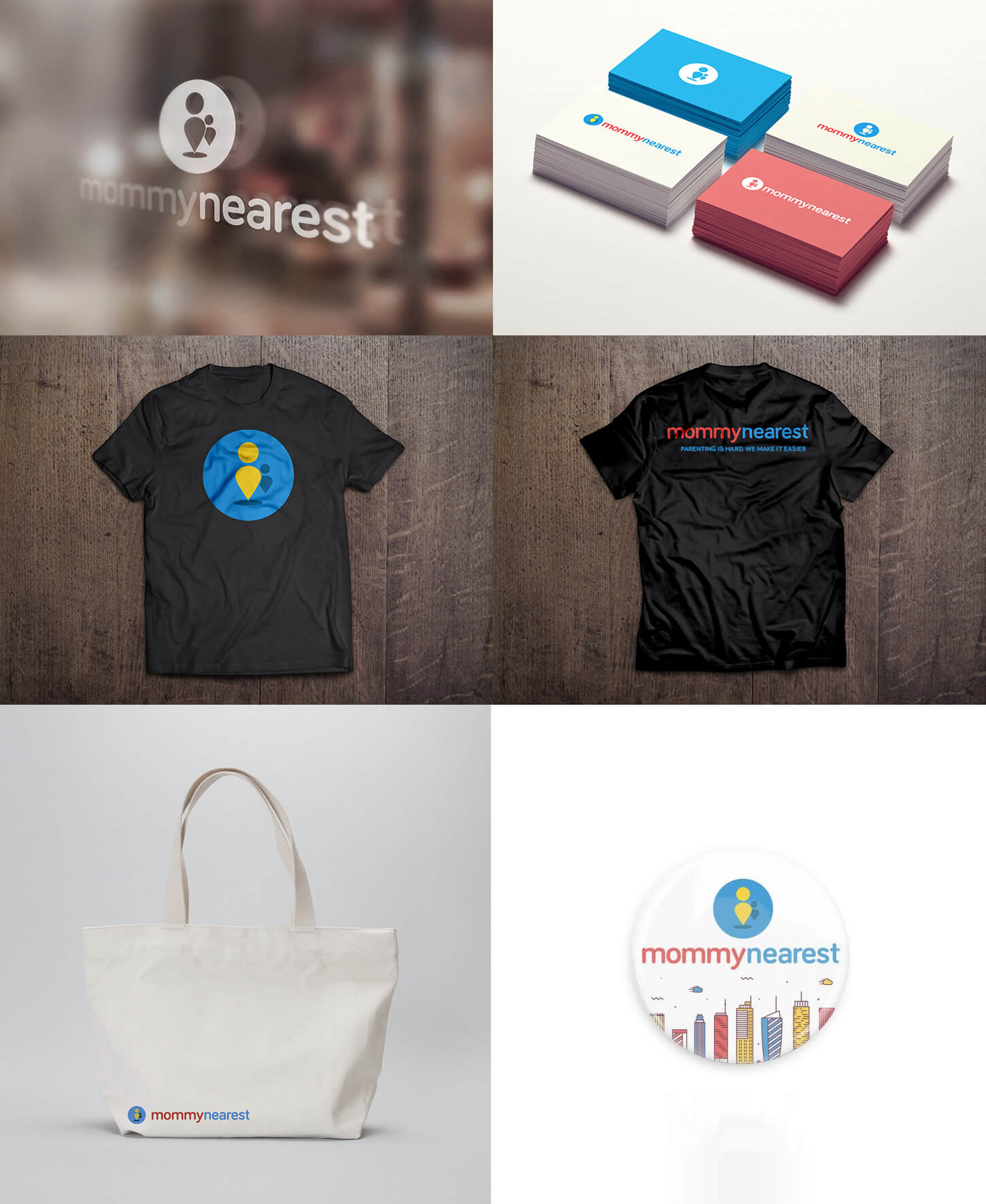
In the end, the last logo deemed “The Little People” was chosen. Next steps were sitting down and creating a style guide that would be used across the company. This included our color scheme, typography, UI items, and marketing material. Here is a small sample of the items created.
PHASE THREE
mommynearest.com
Parenting is hard, We make it easier
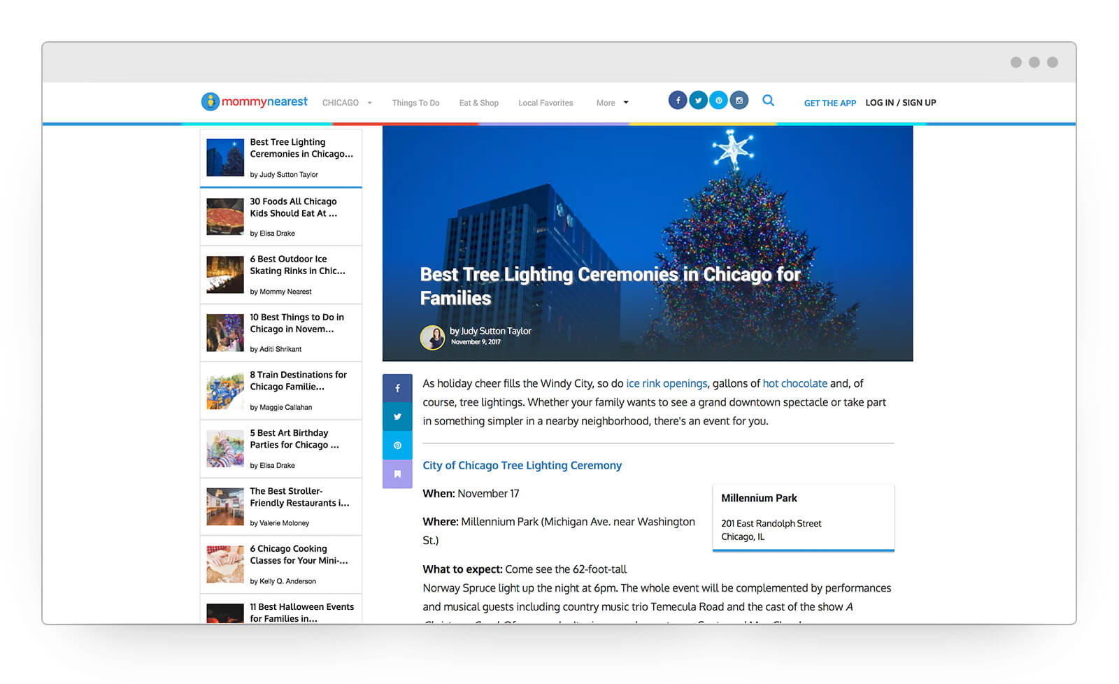
Once marketing items were done, my focus was our web product: mommynearest.com. The website has currently gone through several iterations of modules based on performance.
- Rails Backend
- Ember.js
- SemanticUI
- Mixpanel (Analytics)
- Chartbeat (Analytics)
- Google Analytics
PHASE FOUR
MN Analytics
Mommy Nearest Analytics
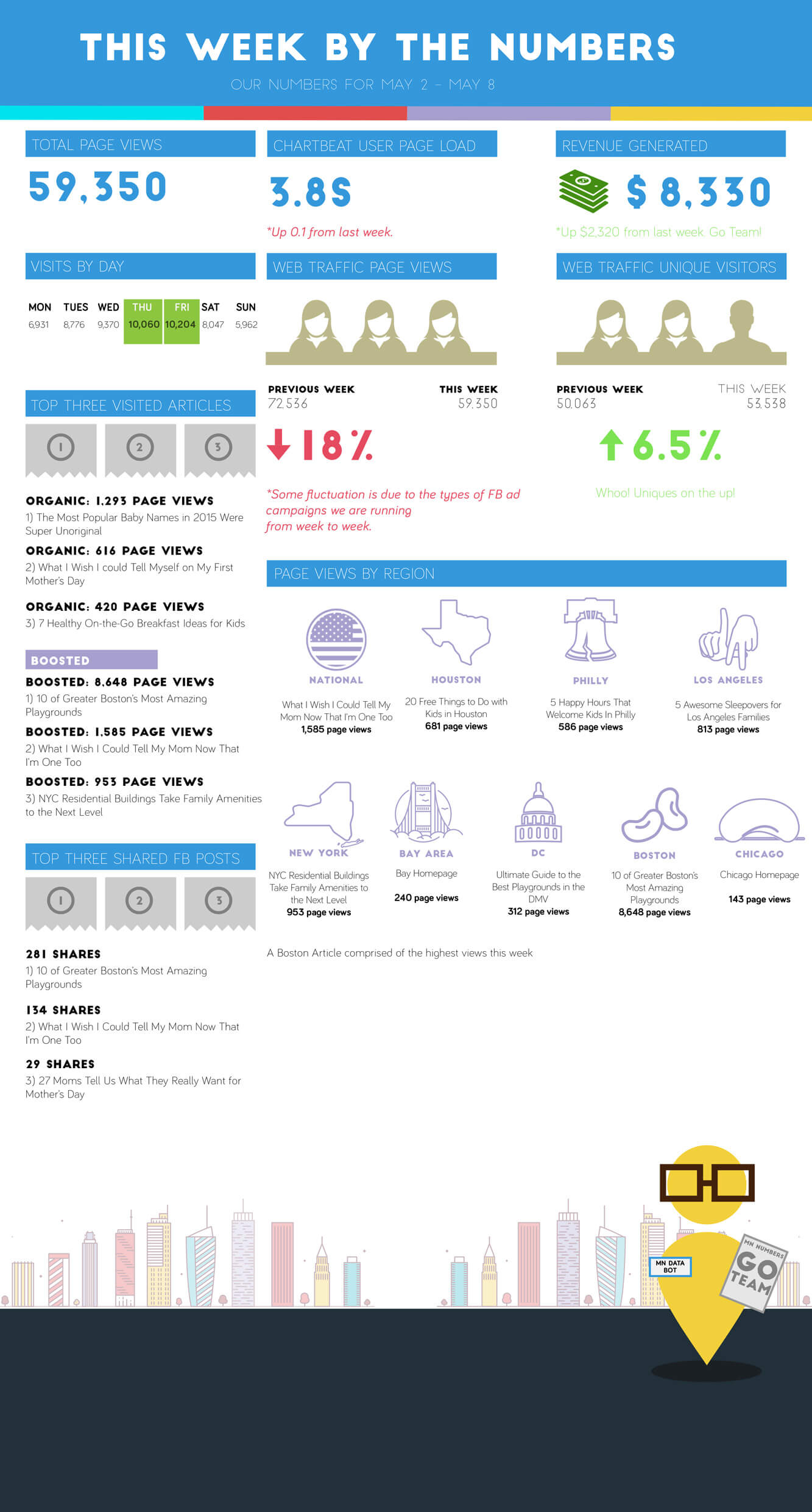
To make sure our iterations were driven by data, I created MN Weekly Numbers where we would dive into numbers over a span of time, then make decisions based on real numbers juxtaposed against our goals.
Want to see the project in action?
Learn more about Mommy Nearest
